- Published on
What Makes A High Converting Link In Bio Page
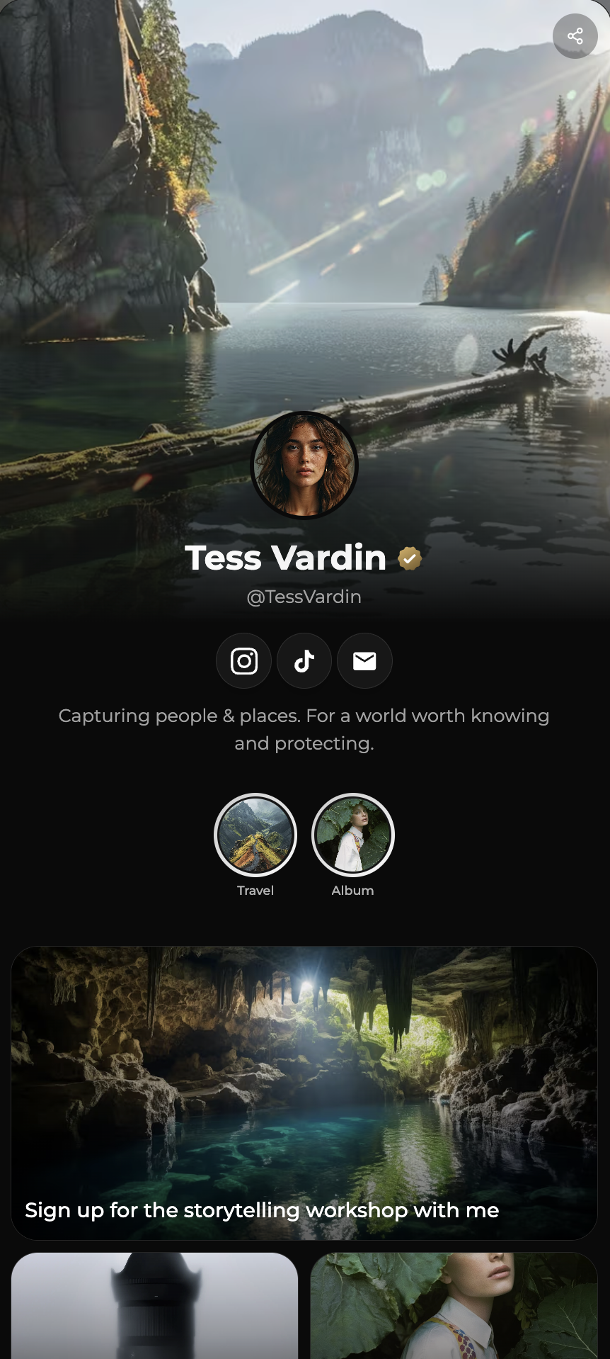
Most link in bio pages look similar.
A profile photo.
A short description.
A stack of buttons.
But only some of them convert visitors into subscribers, clients, or customers.
The difference is not design style.
The difference is structure.
If you want to understand the full growth system first, read:
How To Turn Your Link In Bio Into A Growth Engine
Now let’s break down what actually makes a page convert.
Clear Positioning In The First Screen
Visitors decide quickly whether to stay.
Your page must immediately communicate:
- Who you help
- What you offer
- What result they get
If this is unclear, nothing else matters.
Positioning is the foundation of conversion.
If your page feels generic, you will struggle to stand out.
This article explains why clarity matters:
Elevating Professional Branding With BoringOnePage
One Primary Action
High converting pages focus attention.
They do not compete with themselves.
Common primary actions include:
- Join newsletter
- Download resource
- Book consultation
- View portfolio
Everything else supports this action.
If your page contains too many options, read:
Link In Bio Mistakes That Kill Conversions
Immediate Value Offer
People act when value is clear.
Strong conversion triggers:
- Free guide
- Useful template
- Exclusive insights
- Practical checklist
Visitors should understand the benefit instantly.
If you want to understand why this matters long term, read:
Why Every Creator Needs An Email List
Value builds relationship.
Relationship builds trust.
Clean Visual Hierarchy
Design should guide attention.
A strong hierarchy means:
- Important elements are larger
- Sections are clearly separated
- Primary action stands out
- Spacing improves readability
Good design reduces thinking effort.
If you are unsure whether a bio page is enough for your goals, read:
Bio Site vs Website How To Decide
Focused Audience Targeting
Pages built for everyone convert poorly.
Pages built for specific audiences convert better.
Examples:
- Photographers
- Coaches
- Designers
- Agencies
If you want to see a niche specific example:
Relevance increases engagement.
Minimal Friction
Every extra step reduces action.
Remove anything unnecessary:
- Slow loading elements
- Confusing navigation
- Too much text
- Unclear buttons
Speed and clarity increase conversion.
Trust Signals
Visitors act when they feel safe.
Simple trust builders:
- Testimonials
- Portfolio previews
- Social proof
- Clear branding
Professional presentation increases confidence.
If you want to understand why structure builds trust, read:
Why BoringOnePage Works For Creators And Professionals
Measurable Performance
High converting pages are optimized continuously.
Track:
- Conversion rate
- Click behavior
- Subscriber growth
- Time on page
Improvement requires measurement.
The Simple High Conversion Layout
A proven structure looks like this:
1 Clear headline
2 Short value description
3 Primary action section
4 Supporting links
5 Trust elements
Simple structure. Strong focus.
Final Advice
A link in bio page is not about listing links.
It is about guiding decisions.
Structure creates clarity.
Clarity creates trust.
Trust creates conversion.
If you want a focused page designed for action, you can build yours here: